


Slate-look vinyl flooring copies metamorphic stone, with its soft sheen and hairline clefts, onto a warm waterproof core.
Real slate splits, chips, and demands sealing; the vinyl version installs in a day and forgives everything except steam.
This guide separates the convincing prints from the parking-lot imitations.
Key Takeaways
- Slate wins on soft tonal bands and subtle cleft texture, not bold contrast.
- Gray is classic; green and rust variants carry specific palettes.
- Matte with gentle luster is the authentic sheen; gloss reads fake.
- Tile-format or wide-format both work; grout lines must stay thin and soft.
- Care is standard vinyl: pH-neutral damp mopping, no steam, no wax.
Reading Real Slate in a Print
Slate shows tonal bands drifting across the surface, occasionally interrupted by a hairline cleft or rust spot.
Convincing vinyl reproduces the bands with soft edges. Harsh digital edges and repeated identical veining betray the print.
The sheen matters too. Slate holds a faint luster, not polish; your floor should glow lightly, never shine.
Color Families Beyond Gray
Classic gray slate suits nearly every palette and hides dust best in mid-tones.
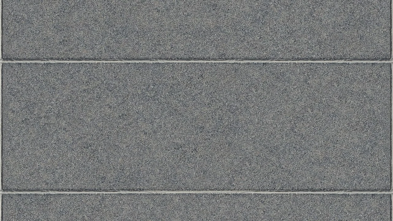
Green slate, subtle sage-gray, pairs beautifully with cream cabinets and aged brass.
Rust and multicolor variants bring warmth but constrain furniture choices. Buy samples in pairs before committing.
Tile Format Versus Plank Format
Tile-format slate, 12 by 12 or 18 by 18, reads most classically, especially with thin grout-pattern lines.
Wide-plank formats reinterpret slate for larger modern rooms and install faster.
Either way, joint lines must stay thin and softly shaded. Thick dark grout print turns floor into toy-stone instantly.
Where Slate Look Excels
Sunrooms and garden rooms: the stone association extends the outdoors inward.
Kitchens gain a hard-working look with none of real slate, which chips under dropped pans.
Bathrooms suit the wet-stone heritage, with textured variants adding grip that polished stone surrendered. For wet rooms, see our bathroom waterproof flooring guide before finalizing the variant.
Slate Versus Concrete and Cobblestone Looks
Slate carries directional tonal bands; concrete shows clouds without direction; cobblestone shows units with joints.
Slate reads calmer than cobblestone and more structured than concrete. It is the middle texture of the stone family.
All three share vinyl’s practical wins: warm, quiet, waterproof, and refactorable plank by plank.
Texture Depth and Underfoot Feel
Embossed cleft texture adds realism and wet-area grip, but too much depth turns cleaning into a combing exercise.
Best-in-class prints texture only within the tonal bands, leaving traffic lanes smooth.
Underfoot, quality slate vinyl feels firm and dry, unlike cold, occasionally damp-feeling real stone in basements.
Installation and Subfloor Notes
Rigid-core formats flatten minor waves that thin LVT would print as shadows under the bands.
Check flatness, sweep, then dry-lay one row to preview band alignment across the room before locking anything. A flat base starts with our uneven subfloor guide.
If grout-pattern lines exist, stagger rows so joints never form long continuous lines across the field.
Cleaning and Long-Term Wear
Weekly damp microfiber with pH-neutral cleaner keeps the tonal bands crisp.
No steam: moisture attacks seams, and heat clouds printed wear layers regardless of brand claims. Cleaner picks live in our LVP cleaner shortlist.
Furniture felt pads preserve the matte luster. Dragged steel legs polish glossy Trails into matte film within weeks.
Cost Bands and Value Logic
Slate-look runs standard vinyl pricing: flat print near two dollars, embossed mid-tier three to five, rigid premium beyond.
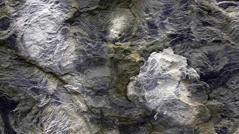
Spend on texture and variation before thickness. Those two traits decide realism; thickness decides comfort.
Spare one box for future repairs. Slate tones vary by run more than neutrals do.
Slate Look in Mountain and Lake Homes
Rustic-modern homes use slate-look vinyl to carry stone heritage without hauling real slab upstairs.
Pair with reclaimed beam ceilings and leather furnishings; let the floor read as the refined element in the room.
Rust and multicolor variants suit timber frames; classic gray suits whitewashed shiplap modern-rustic.
The waterproof core also forgives wet ski boots and lake mornings that real clefted slate would absorb permanently.
Backsplash and Fireplace Coordination
Real slate hearths and vinyl slate floors rarely match tone-for-tone. Aim for tonal kinship instead: same color family, different value.
If both surfaces sit in one sightline, separate them with a contrasting rug or hearth trim so the two textures do not argue.
Kitchen backsplashes in real tile along slate-look floors should carry the grout tone, not the tile tone.
When renovating in stages, keep the floor neutral gray; it partners with whatever backsplash the next season brings.
Basement and Lower-Level Strategy
Slate-look rigid core over a moisture-film underlayment is the strongest below-grade stone impression available.
Test slab moisture anyway; printing amplifies any adhesive or vapor staining that telegraphs through flexible goods.
The warm underfoot feel fixes slate’s coldest complaint: basement floors people actually walk on barefoot.
Pair with warm LED cove lighting to keep the stone association from chilling the lower level.
Grout Line and Joint Strategy
Hairline joints in matching shade are the realism baseline. Two-tone grout print, joint-shadow effect, adds depth from standing height.
Avoid contrasting mortar looks entirely except in deliberate farmhouse recreations.
Staggering rows so joints never cross continuously preserves the laid-stone story across the whole field.
The joint tone also sets cleaning strategy: mid-tones forgive, dark shows soap film, light shows grit.
Furniture and Hardware Pairings
Aged brass and oil-rubbed bronze echo slate’s mineral character; polished chrome fights it.
Wood furniture in medium to dark tones grounds the stone; pale bleached woods float unresolved.
Upholstery in cream, moss, or rust amplifies the palette naturally. Bright synthetics read as noise.
Iron and stone accents complete the earth palette without extra color risk.
Wet-Area Details That Matter
Silicone, not grout, at tubs, showers, and exterior doors. Flexibility, not rigidity, keeps the seam waterproof.

Slate-look threshold pieces bridge to tile showers without height breaks.
Bath mats with felt backing, never rubber, protect the printed luster from discoloration.
Ventilation still matters: printed wear layers tolerate humidity, but seams reward dry air.
Slate Look Cost and Value Bands
Expect two dollars for flat print, three to five for embossed rigid core, and premium lines beyond.
Real slate installed runs four to eight times more, plus sealing every two years forever.
The lifetime math favors vinyl in every scenario short of-century homes built for generations.
One spare case plus felt pads complete the value package.
Working With Existing Stone Elsewhere
Granite counters and slate floors coexist when both stay cool-toned. The clash arrives with warm rust variants.
Marble counters want calmer gray slate prints; busy veining meets veining and both lose.
Travertine and warm stone partner with rust or green slate variants instead.
When in doubt, choose the quieter print. Stone-on-stone rooms need one star, not two.
Slate Look and Heated Floors
Slate-look vinyl pairs with radiant heat far better than real stone, which insulates and slows the system.
Check the maker surface limit, usually around 85 degrees, and ramp temperature gradually each season.
Thin rigid-core formats transfer heat efficiently; thick embossed versions lag slightly but still outperform quarried slate.
For cold-climate baths, this combination is the strongest argument for the look over any natural stone.
Mistakes to Avoid
- Buying high-contrast multicolor print. It dominates the room like costume stone.
- Accepting thick dark grout print. Real slate joints are hairline and shadowed.
- Gloss finish. Slate faintly lusters; gloss reveals the vinyl and dust simultaneously.
- Steam cleaning. Heat clouds the print and wicks moisture into seams.
- Ignoring dry-lay preview. Misaligned bands across the room cannot be fixed post-lock.
Frequently Asked Questions
Is slate-look vinyl flooring durable?
Yes, with 12-mil or better wear layers it matches any vinyl’s durability and outlives sealed real slate indoors.
Does slate-look vinyl look cheap?
Only when it repeats identical veining or uses thick grout lines. Good prints vary every tile.
Is slate-look vinyl waterproof?
The vinyl body is waterproof; keep water out of seams with proper sealing at wet edges.
How does slate look versus real slate compare?
Real slate chips, needs sealing, and costs multiples installed. Vinyl holds the look with zero maintenance.
What rooms suit slate-look vinyl best?
Kitchens, baths, sunrooms, and entries where stone imagery feels natural.
Bedrooms suit softer looks; tile-and-rug combos balance the hardness elsewhere.
Mudrooms gain the most, printing that hides grit and salt between weekly rinses.
Can you use steam mops on slate-look vinyl?
No. Steam wicks into seams and clouds printed wear layers over time.
Is slate-look vinyl slippery when wet?
Embossed textured variants grip well. Smooth gloss prints are the risky ones.
What size tile format looks most realistic?
Twelve by twelve with hairline grout reading is the classic slate layout.
📐 Free Tool: Flooring Calculator
Enter your room size — see exactly how many boxes you need, waste included.
Conclusion
Slate-look vinyl keeps metamorphic drama on a practical budget: soft bands, gentle luster, warm underfoot.
Choose variation over contrast, thin soft joints over printed mortar, matte over shine.
Buy it for the texture, install it on a flat base, and the floor out-stones real slate in every practical column. Keep one spare case in the attic and the floor stays repairable for years.


