


Stone vinyl flooring gives you slate, travertine, limestone, or terrazzo looks without the cold slab, the sealing ritual, or the cracked-tile repair bill.
The trouble is that “stone look” covers wildly different prints, and the wrong one fights your cabinets for a decade.
This guide sorts the stone families, the realism cues worth paying for, and the rooms where each look actually belongs.
Key Takeaways
- Match the stone family to the room: slate reads rustic, travertine warm, terrazzo playful, limestone quiet.
- Tile-look formats with printed grout lines read more convincing than continuous sheet in large rooms.
- Matte and lightly textured finishes beat gloss — real stone floors are rarely polished anyway.
- Rigid cores are non-negotiable on slabs; printed stone telegraphs every hump in the subfloor.
- Keep one stone surface per sightline; stone floor plus stone backsplash plus stone counter is too much.
Why Stone Looks Dominate Vinyl Catalogs
Stone prints now outsell wood in bathrooms and basements because they solve two problems at once: water and warmth.
They read architectural rather than decorative, which photographs well and staggers less with trend cycles.
The format has matured too: layered ink now builds the shadow inside each vein instead of painting flat gray clouds.
What has not changed is the failure mode — cheap stone prints look like vinyl from across the room, and no amount of styling fixes that.
Slate, Travertine, Limestone and Terrazzo
Slate prints carry cleft texture and cool mineral tones; they suit rustic plans, mudrooms, and mountain homes.
Travertine warms a room instantly with beige bands and soft pitting; it partners with cream cabinets and brass.
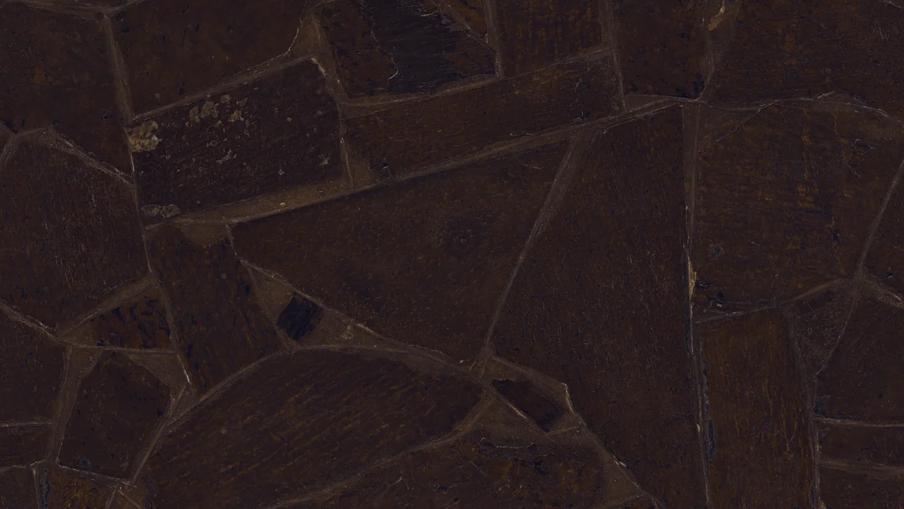
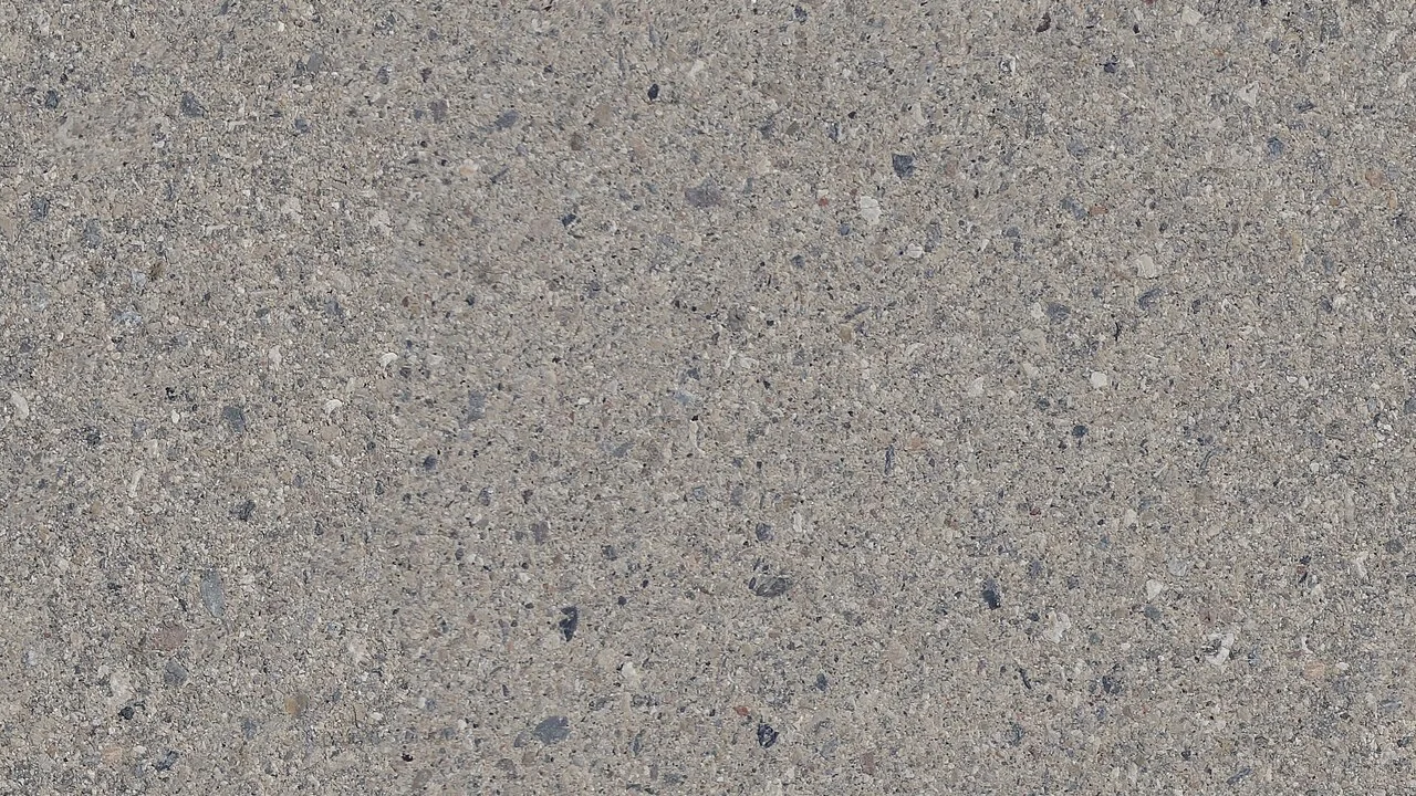
Limestone is the quietest option — pale, even, almost cloudless — and works in minimal bathrooms.
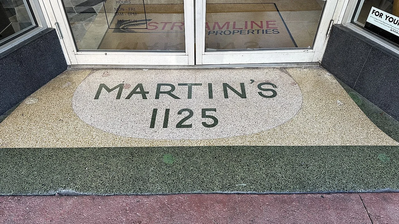
Terrazzo adds chips and speckle for playful retro rooms; it hides crumbs better than any solid stone print.
The Realism Cues Worth Paying For
Vein randomness is the first test: repeating vein clusters expose the print at a glance.
Embossed-in-register texture is the second: the surface should follow the printed grain, not sit flat above it.
Grout-line depth matters in tile formats; drawn shadows convince more than painted dark lines.
Third, tonal variation between tiles — real stone never ships color-matched, and neither should good vinyl.
Tile-Look Versus Sheet
Tile-look planks and squares read convincing in rooms above 80 square feet where grout lines have space to repeat.
Sheet vinyl wins in small wet rooms: no seams to collect water, no grout lines to fake.
Large-format tile-look (12×24 graphics) reads more high-end than small squares but demands a flatter subfloor.
In basements, sheet is often the practical choice because slab imperfections hide better in a continuous field.
Bathrooms and Wet Rooms
This is stone vinyl’s home turf: waterproof cores handle splash zones that would etch real limestone.
Slate and limestone prints suit walk-in showers; terrazzo suits family baths with kids.
Seal the perimeter with silicone rather than grout, and keep expansion gaps behind trim.
Heated floors underneath remove the last argument for real stone — warm feet with none of the sealing.
Kitchens
Stone prints ground a kitchen without the maintenance of sealed travertine, which stains at the first oil spill.
Pair them with painted cabinets, not wood-grain melamine; two competing textures look unresolved.
Choose tighter prints near prep zones — heavy cleft texture traps flour in the grooves.
A washable mat at the sink protects both the print and your lower back.
Basements and Utility Rooms
Below grade, stone looks brighten windowless rooms better than dark wood prints.
Rigid core over a six-mil vapor film is the standard assembly; test the slab for moisture first.
Attached-pad formats remove one layer from the stack and add warmth to cold concrete.
Avoid pale limestone prints in workshops — every metal shaving shows as a dark speck.
Living Rooms and Open Plans
Stone in living areas works when the room is otherwise soft: wool, linen, wood furniture, warm light.
Large-format slate fields suit modern rooms; small checkerboard stone prints date fastest here.
One tonal rug in the seating zone keeps the field from feeling like a showroom.
If the room connects to a wood-floored hall, repeat one tone from the stone print in the transition trim.
Grout Lines and the Illusion
Printed grout should be one to two millimeters wide; chunkier lines read as budget tile immediately.
Mid-gray grout tone forgives everything; white grout shows every crumb in a printed floor that never needs scrubbing.
Stagger joints so lines never run continuously across the room — real stone layouts break the grid.
In small rooms, fewer grout lines (larger tiles) enlarge the space visually.
Wear Layer and Core Choice
12-mil wear layers cover family bathrooms and kitchens; 20-mil is the minimum for mudrooms and pets.
SPC cores resist point loads from heavy vanities; WPC feels warmer but flexes more on uneven slabs.
Check the water-resistance claim on the core, not the wear layer — a waterproof top on a swelling core is marketing.
Thickness in millimeters sells; wear layer in mils decides whether you replace the floor in year eight.
Subfloor Flatness and Underlayment
Stone prints show humps more than wood grain because the eye expects stone to be flat.
Three millimeters over two meters is the working tolerance for floating tile-look planks.
Foam underlayment is fine; cork adds warmth but can telegraph seams through thin tiles.
On slabs, always use a vapor film and test moisture before anything else.
Installation Details
Acclimate cartons flat for 48 hours; cold rigid planks shrink and open grout-line joints.
Dry-fit a row to check the printed grout alignment against the room’s main sightline.
Leave expansion gaps at every wall and around pipes; stone prints show buckling dramatically.
For a deeper walkthrough, see installing vinyl plank flooring step by step.
Cleaning Stone-Print Vinyl
Microfiber sweep weekly; textured stone holds dust that flat floors release.
pH-neutral damp mop, then a dry pass — stone prints show streaks as tonal bands.
Never steam, never bleach, and never wax a vinyl wear layer.
For product picks, see cleaners that suit vinyl plank floors.
Cost Bands
Flat stone sheet starts near two dollars per square foot and suits small bathrooms.
Embossed tile-look rigid core runs three to six, which is where realism lives.
Premium large-format stone prints pass seven and compete with mid-range porcelain installed.
Buy ten percent overage plus one spare carton from the same lot.
Pairing With Real Stone Elsewhere
If the kitchen has granite counters, choose a quieter stone print — two loud stones cancel each other.
Real slate hearths pair with gray slate vinyl when the tones sit in the same family, not the same shade.
Travertine counters want limestone or travertine prints, never terrazzo.
When in doubt, let the real stone lead and keep the floor almost plain.
When Stone Vinyl Disappoints
Glossy stone prints look like plastic within a month of foot traffic.
Pale limestone in a busy mudroom shows every footprint and salt ring.
Small-format stone print in a large open plan reads busy and dated.
If you want stone because of resale value, remember buyers check the material, not the print — price it accordingly.
Planning the Whole Floor
One stone family through connected rooms keeps the plan coherent; switching from slate to travertine at a doorway reads accidental.
For how stone compares with wood and color looks, see the vinyl plank color guide.
Order every room from one dye lot; stone tones shift more between lots than neutral prints.
Keep a labeled spare carton — matching stone prints after the fact is nearly impossible.
Stone Vinyl in Laundry and Utility Rooms
Utility rooms reward stone prints because they hide lint and drips better than wood grain.
Terrazzo and mid-gray slate are the forgiving choices; pale limestone shows every dropped sock.
A waterproof rigid core handles a leaking washer better than any tile with grout to wick water.
Keep one washable mat at the machine; stone texture traps detergent dust in the grooves.
Mistakes to Avoid
- Buying a glossy stone print that reflects every footprint and reads as plastic.
- Repeating vein clusters from a cheap print — the clone pattern is visible across a room.
- Installing tile-look stone on an uneven slab, where every hump telegraphs as a shadow band.
- Pairing a busy stone floor with a busy stone backsplash and losing both.
- Skipping a moisture test on a concrete slab and blaming the floor for the cupping.
Frequently Asked Questions
Does stone vinyl flooring look real?
Embossed tile-look prints with random veining do at standing height.
Flat glossy prints never do.
Which stone look hides dirt best?
Terrazzo and mid-gray slate.
Pale limestone shows every mark.
Can stone vinyl go in a shower?
Only with a waterproof rigid core and sealed perimeter.
Sheet format removes seam risk entirely.
Is stone vinyl slippery?
Matte and textured finishes grip well when dry.
Gloss is the slippery exception — avoid it in wet rooms.
What wear layer do I need?
12-mil for bathrooms and kitchens.
20-mil for mudrooms, pets, and rentals.
Can it go over old tile?
Yes if flat, bonded, and under six millimeters.
Skim the grout lines so the print stays smooth.
Does stone vinyl need sealing?
No — the wear layer is the protection.
Real stone needs sealing; this is the point of the print.
How much extra should I order?
Ten percent, plus one unopened carton stored flat.
📐 Free Tool: Flooring Calculator
Enter your room size — see exactly how many boxes you need, waste included.
Conclusion
Stone vinyl succeeds when the family, the finish, and the format agree with the room.
Slate for rustic, travertine for warm, limestone for quiet, terrazzo for playful — pick one per plan.
Spend on embossed realism and a flat subfloor; those two decide whether anyone believes the print.


